
Problem
Problem
Problem
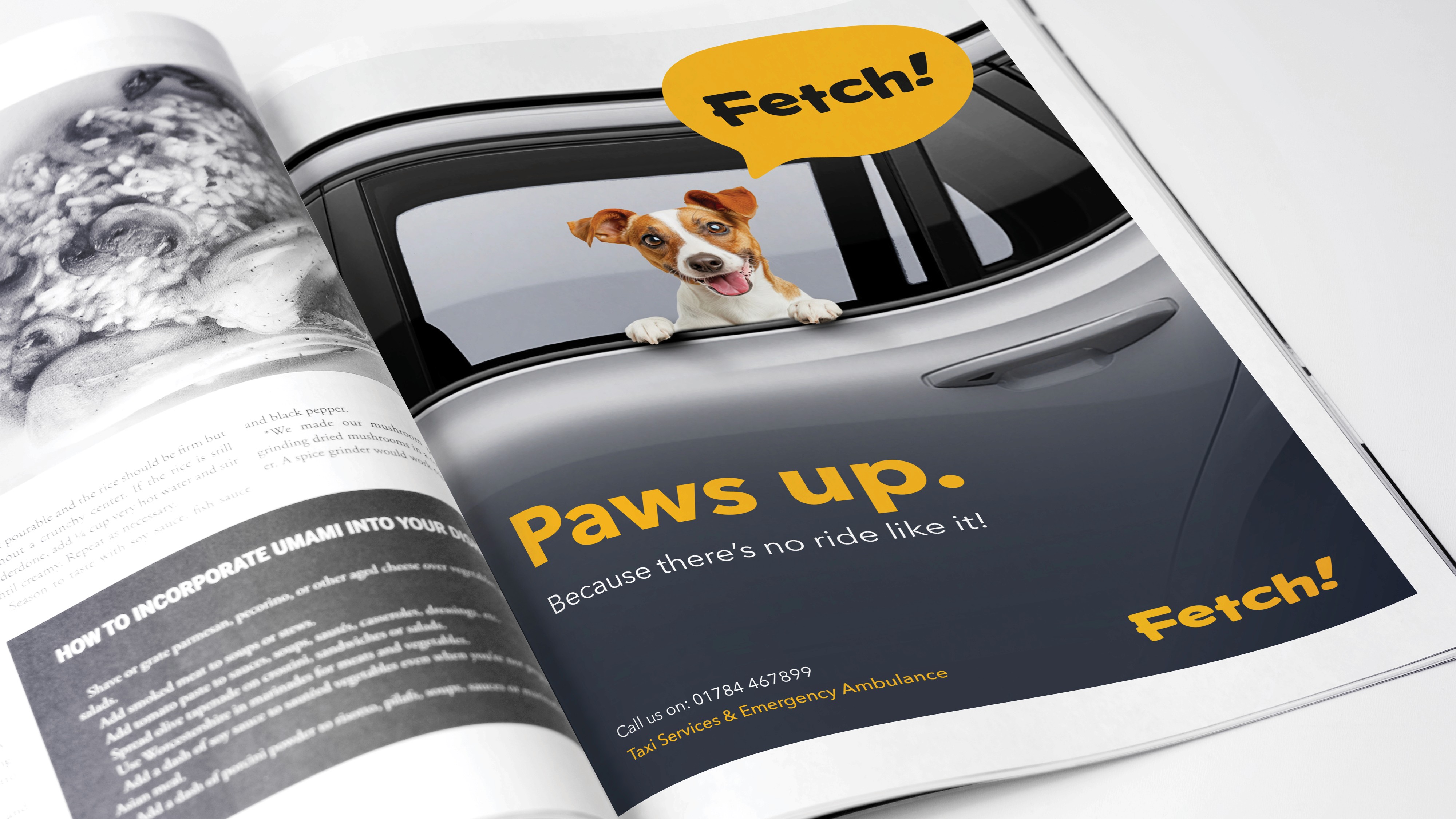
A new animal transport company approached for support with brand naming and identity design. The client wanted to create a fresh, approachable brand that would resonate with a younger generation of pet owners seeking safe and convenient transportation for their animals.Bookings are made through a dedicated app, with the most common journeys including trips to and from veterinary clinics, pet sitters, and boarding.
A new animal transport company approached for support with brand naming and identity design. The client wanted to create a fresh, approachable brand that would resonate with a younger generation of pet owners seeking safe and convenient transportation for their animals.Bookings are made through a dedicated app, with the most common journeys including trips to and from veterinary clinics, pet sitters, and boarding.
A new animal transport company approached for support with brand naming and identity design. The client wanted to create a fresh, approachable brand that would resonate with a younger generation of pet owners seeking safe and convenient transportation for their animals.Bookings are made through a dedicated app, with the most common journeys including trips to and from veterinary clinics, pet sitters, and boarding.
Solution
Solution
Solution
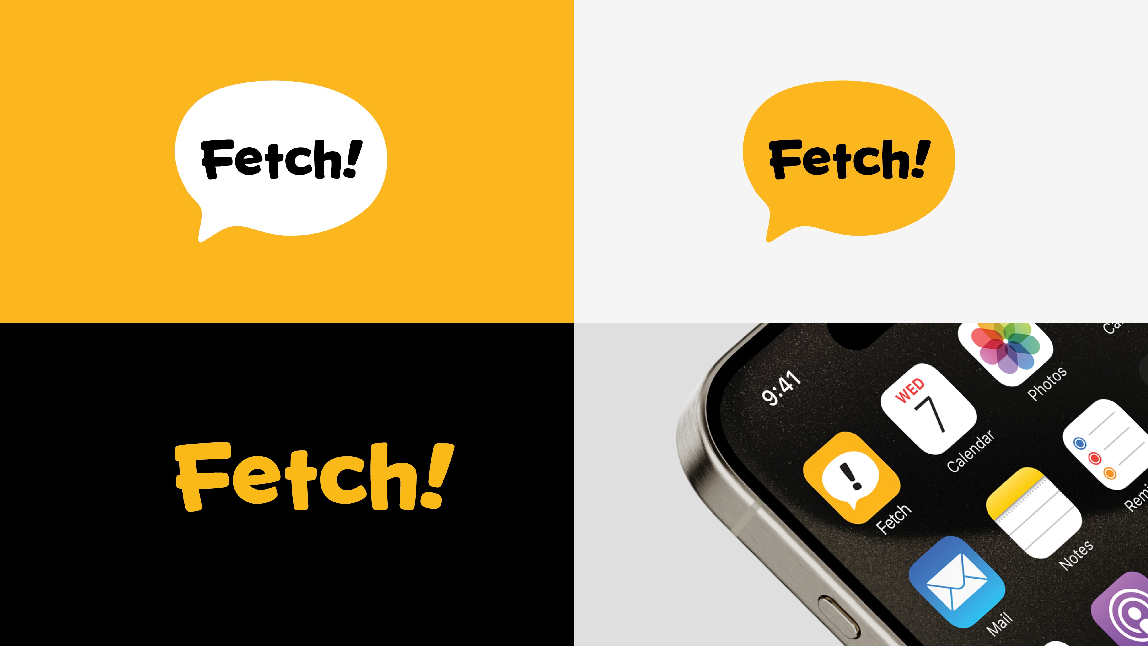
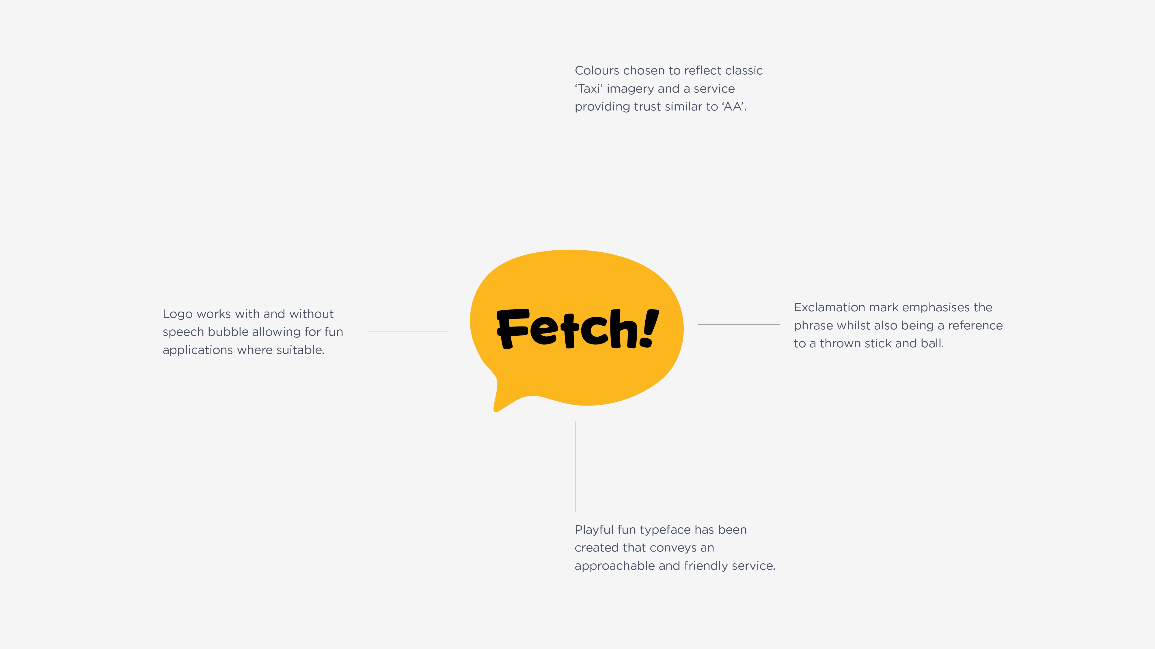
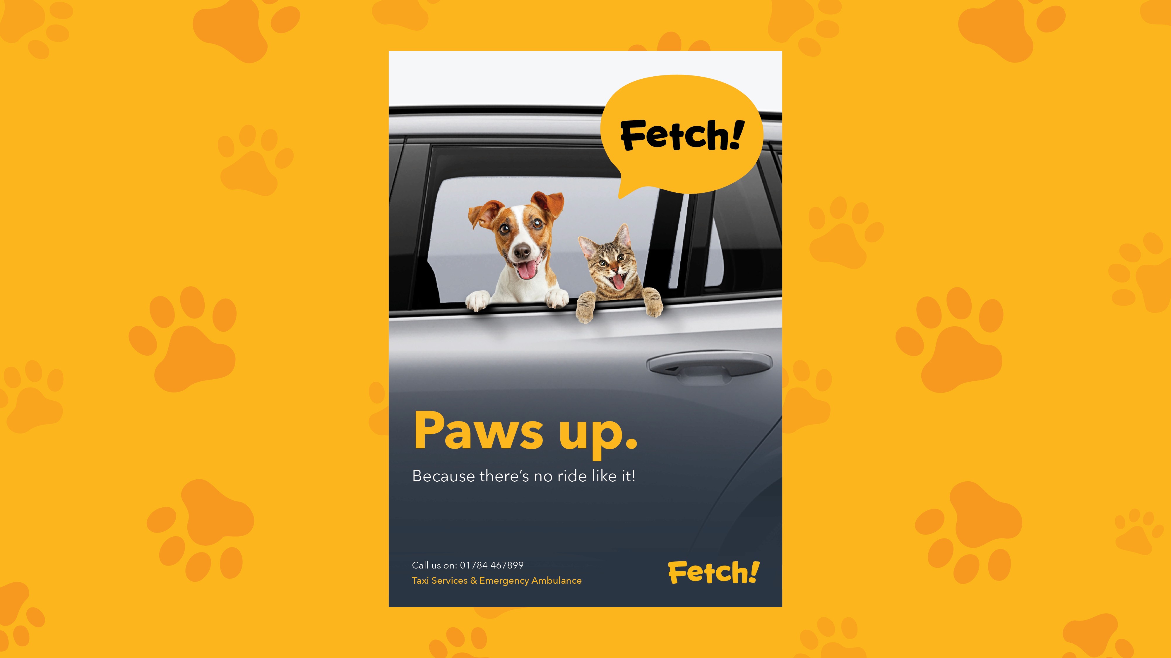
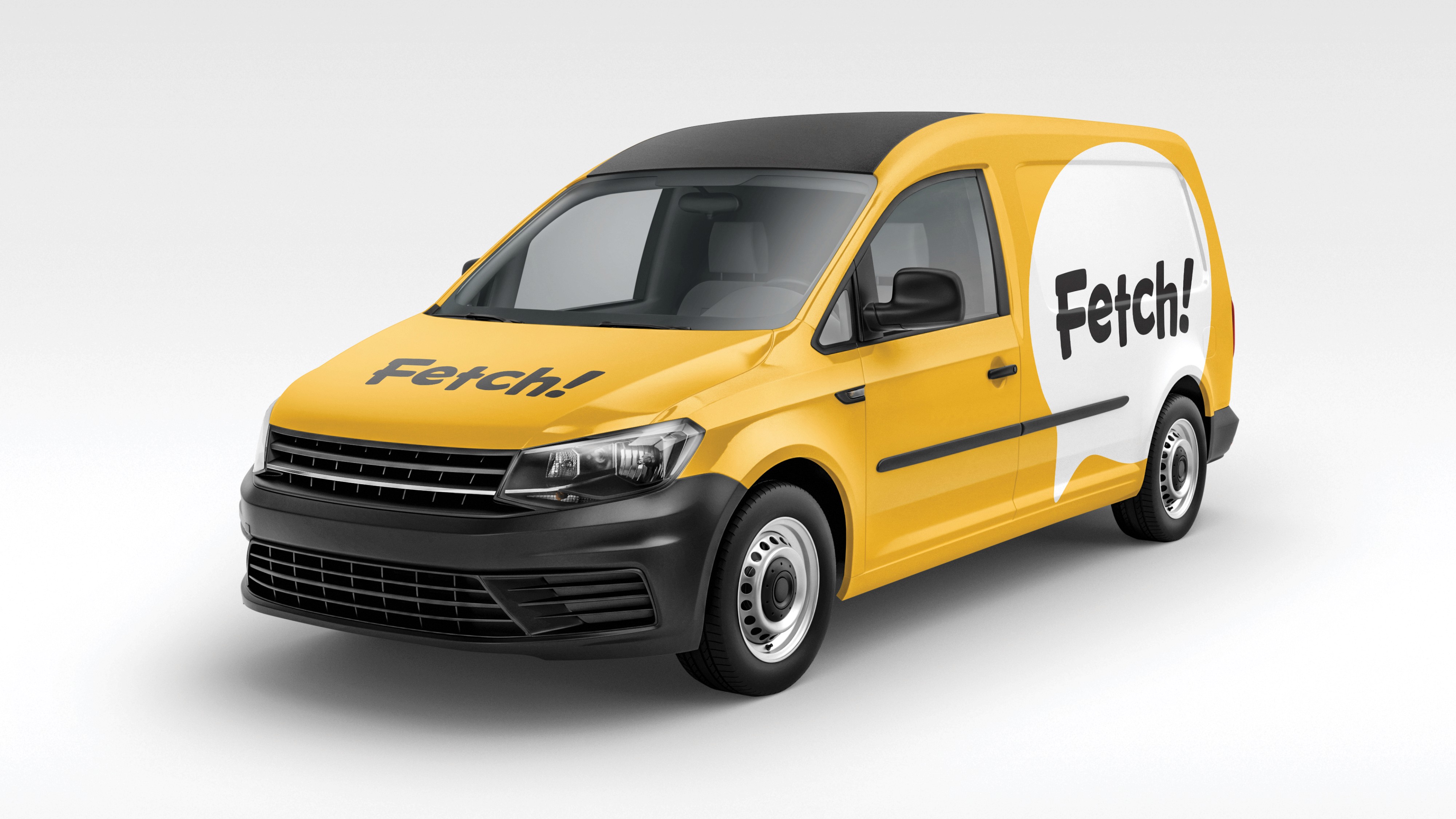
‘Fetch!’ emerged as the preferred choice from the researched shortlist of proposed names. It was selected for its dual meaning: clearly communicating the transport service while drawing on the strong association with dogs, the most common passengers. The name brought an immediate sense of personality to the brand. This was reinforced through a lively, characterful wordmark, creating a visual identity that felt both professional and approachable.
‘Fetch!’ emerged as the preferred choice from the researched shortlist of proposed names. It was selected for its dual meaning: clearly communicating the transport service while drawing on the strong association with dogs, the most common passengers. The name brought an immediate sense of personality to the brand. This was reinforced through a lively, characterful wordmark, creating a visual identity that felt both professional and approachable.
01

02
03
04
05
06
07